BY The Funders Network Staff
The Funders Network is committed to creating an inclusive and accessible environment for our members and others — including in the digital space.
In this age of social distancing and remote work set-ups, we are all spending more time than ever engaging in the online world. That’s why it’s even more important than ever to ensure online platforms are able to provide information and resources in ways that allow equitable access for users of varying abilities and learning needs.
In keeping with that commitment, we’ve taken steps to make The Funders Network website accessible and compliant with Web Content Accessibility Guidelines (WCAG 2.1), Americans with Disability Act website requirements and guidelines and s508 compliance.
As noted by ADA.gov, “poorly designed websites can create unnecessary barriers for people with disabilities, just as poorly designed buildings prevent some people with disabilities from entering. Access problems often occur because website designers mistakenly assume that everyone sees and accesses a webpage in the same way.”
Our website includes features that enable users to adjust the design and user interface of the website to provide accessibility and accommodations for a variety of needs.
Depending on the setting you select, the application offers:
- Screen-reader optimization for blind users.
- Keyboard navigation optimization for the motor impaired.
- A stop to all flashing animations that may contribute to seizures.
- Highlight bar that limits onscreen distractions for those with ADD/ADHD (and other learning styles were limited visual clutter is helpful.)
- User interface and design adjustments for the visually impaired, including the ability to change font size and color settings.
How to Use
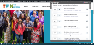
To see our accessibility application in action, click on the orange accessibility icon on the bottom right corner of The Funders Network website. (You’ll see this icon at the bottom right of your screen, regardless of where you are on our site.)

When you click on the orange accessibility icon, you’ll see a menu that allows you to customize your experience on the site based on your needs and preferences.

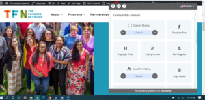
If you continue to scroll down on our accessibility menu, you’ll see additional options that allow you to customize the user experience on our site, including the ability to change font size, color saturation and the size of the mouse cursor — to name just a few options.

Please keep in mind that increasing font size may require you to adjust the setting on your computer monitor or use the horizontal scroll bar on your screen in order to read the full text.
About the TFN Website
This new feature comes as TFN continues to improve how we connect and engage with our members and others across the sector. This summer, we launched the new TFN website with host of resources that will help you better navigate TFN’s rich offerings of programs and resources, including a new section devoted to our approach to racial equity, a digital library featuring our most recent publications, and an interactive membership map to better identify potential connections in your region. TFN has worked with SimpleFly Creative, a Miami-based, Latinx-led graphic design firm, to create our website. If you have any questions or feedback about the TFN website, including the new accessibility features, please contact TFN’s Director of Communications Tere Figueras Negrete at tere@fundersnetwork.org.
